Designing Ordnance Survey’s mapping design system
My role
Working alongside another designer, we designed and built Ordnance Survey’s first digital design system for mapping applications.
This design system project was run alongside another live service project. I worked across the two.
I drove the requirements I captured from the live project, collaborating with my design counterpart and sharing the execution of the UI details. I also led user testing the design system via my live project.
In short, a big piece of work completed by two designers and a developer
About the company
Ordnance Survey is a specialist in geographic data with a 200 year history. They provide maps, geographic data and consultancy services.
The company produces data and services for B2B, B2G and B2C organisations.
Please note that due to important NDAs and respect for my previous employer, this will be a deliberately limited view of the process and work
Team
Product Designers x2
Front end developer x1
Understanding the requirements for the mapping design system by referencing other projects
The company had several mapping products that could be supported by a new design system. I referenced the needs of:
Consumer map application OS Maps
Industry projects requiring mapping
Mapping out the UX interactions, then giving them a priority order
Once as many of the known requirements had been captured, I gave an order to them in which we designed and built first based on my understanding of the live projects timeframes. Working closely with different project stakeholders helped with this.
Co-creating with sketches through the UX design phase, exploring variations of designs
Working through UX patterns and interactions together and bring in a developer early helped us work quickly and accurately.
I referenced other mapping applications to understand any existing commonly used patterns or expectated behaviour for users.
Taking a V1 prototype into user testing, then refining it based on feedback
I ran three rounds of user testing of a prototype. After each round we would reflect and iterate on the design, using the feedback we received. Some components needed a totally new approach, others smaller design edits.
User testing participants were taken from each project, staff with mapping experience and some with no experience (for consumer audiences).
We used an atoms, molecules and organisms methodology. Building up large components from smaller consistent pieces.
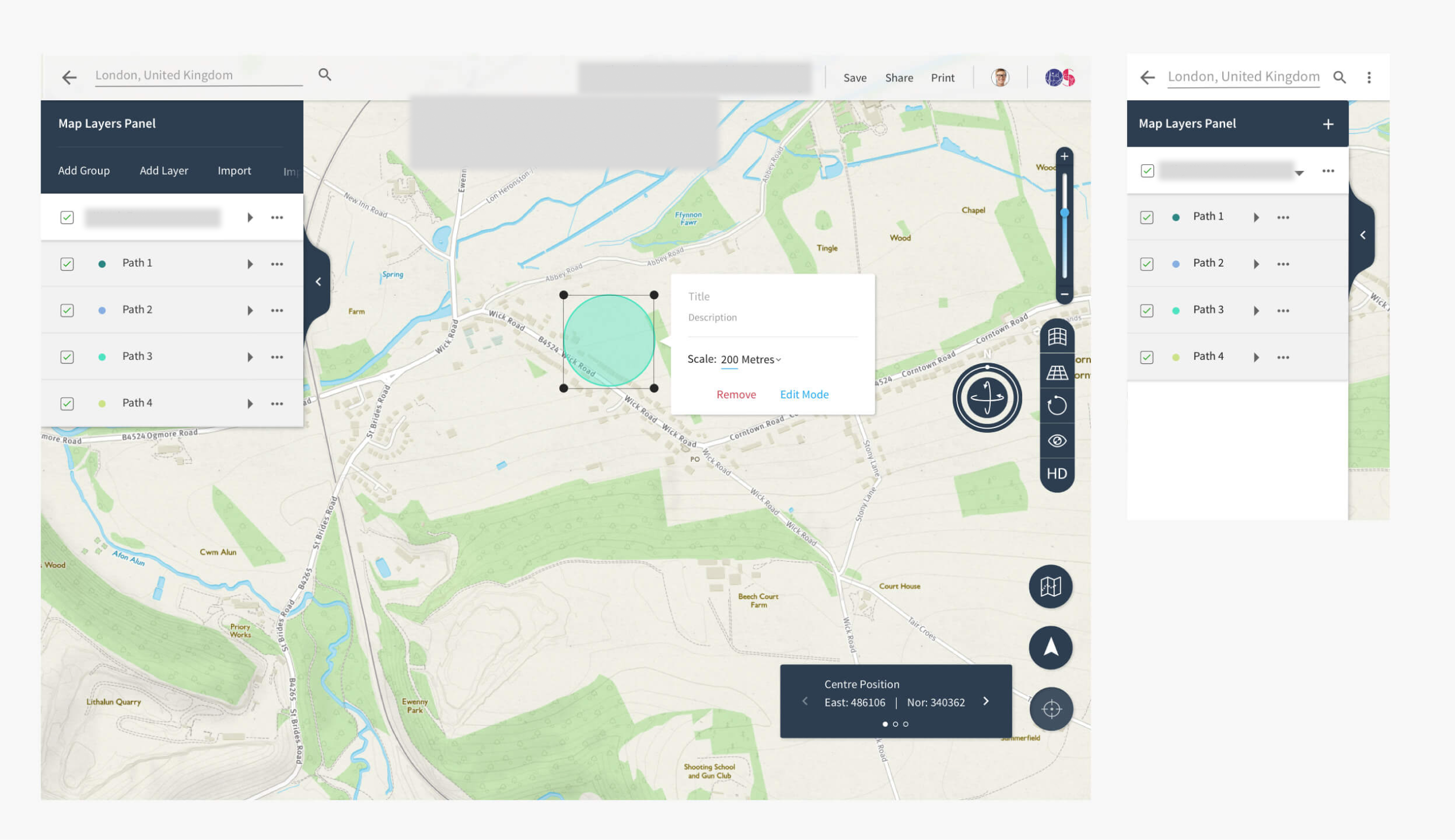
Example components to create different mapping interfaces depending on the requirements and objectives of the product.
Playing back the Design System to multiple groups of stakeholders was important to get buy in and raise awareness.
Below shows how the system works across a variety of examples
Some examples of the system built and working
Highways data
Boundary line data
Open layers data


