Redesigning a complex software product at IBM
About the product
IBM MQ is long standing messaging middleware product that facilitates the flow of information between enterprise applications.
IBM MQ comes with a brand and a history of being one of IBM’s most dependable offerings. Over time it has become a trustworthy piece of software for many developers and administrators with 85% of Fortune 500 companies and 94% of the worlds top 100 banks trusting it to support their infrastructure.
It is widely used by banks, healthcare, airline, and insurance companies, among many others.
My role
I was a Senior Product Designer leading through experience as an independent contributor. Owning the deliverables of the project end to end. Supported by the broader product suite’s Lead Designer. Working with two mid designers.
We used IBM Design Thinking framework to work through this project.
Challenge
As part of a broader product strategy, we were improving how we combined products into one suite. Allowing a customer to access several products from one interface, providing a better seamless experience. Customers could add in additional product lines to their suite depending on their needs
Team
Senior Product Designer - me
Mid UI Designer
Lead Product Designer (of the product group)
User Researcher supporting
Design strategy kick off, why was this work needed?
As part of the product strategy we were combining different products to be available in one interface called IBM Cloud Pak for Integration. Customers could add in additional products depending on their needs and maintain their setup in one place.
With every aspect of the UI being redesigned, this gave us opportunities to add new UX features
Collaborating with senior product management and engineering on the product vision
We needed to find out what we could improve in the product proposition with senior product stakeholders.
We started by gathering our designers, engineers, project managers and our stakeholders to determine the direction.
Focus one
Evolve the product using feedback in a significant redesign.
Focus two
Product to fit within the broader suite of products we offer.
Spending extra time with the users of our product
As you can imagine IBM works very closely with it’s customers to support them and to build it’s products. We had user research from the suite to draw on, client teams to work with and Product Managers who work closely with customers too.
User persona secondary
Enterprise Architects
They ensure the technical progression of his company matches business goals. They enjoy bringing innovation into IT and evaluates new technology for the company to take on. They don’t work hands on with MQ anymore, but has a deep conceptual understanding of the product.
User persona primary
MQ Administrators
They are responsible for the daily running of the MQ setup. They have a deep understanding of MQ at both at a conceptual and implementation level.
Gathering user feedback, insights and user goals
Client workshops
With the lead designer, we ran a mix of workshops with clients resulting in creating user needs statements
Stakeholder workshops
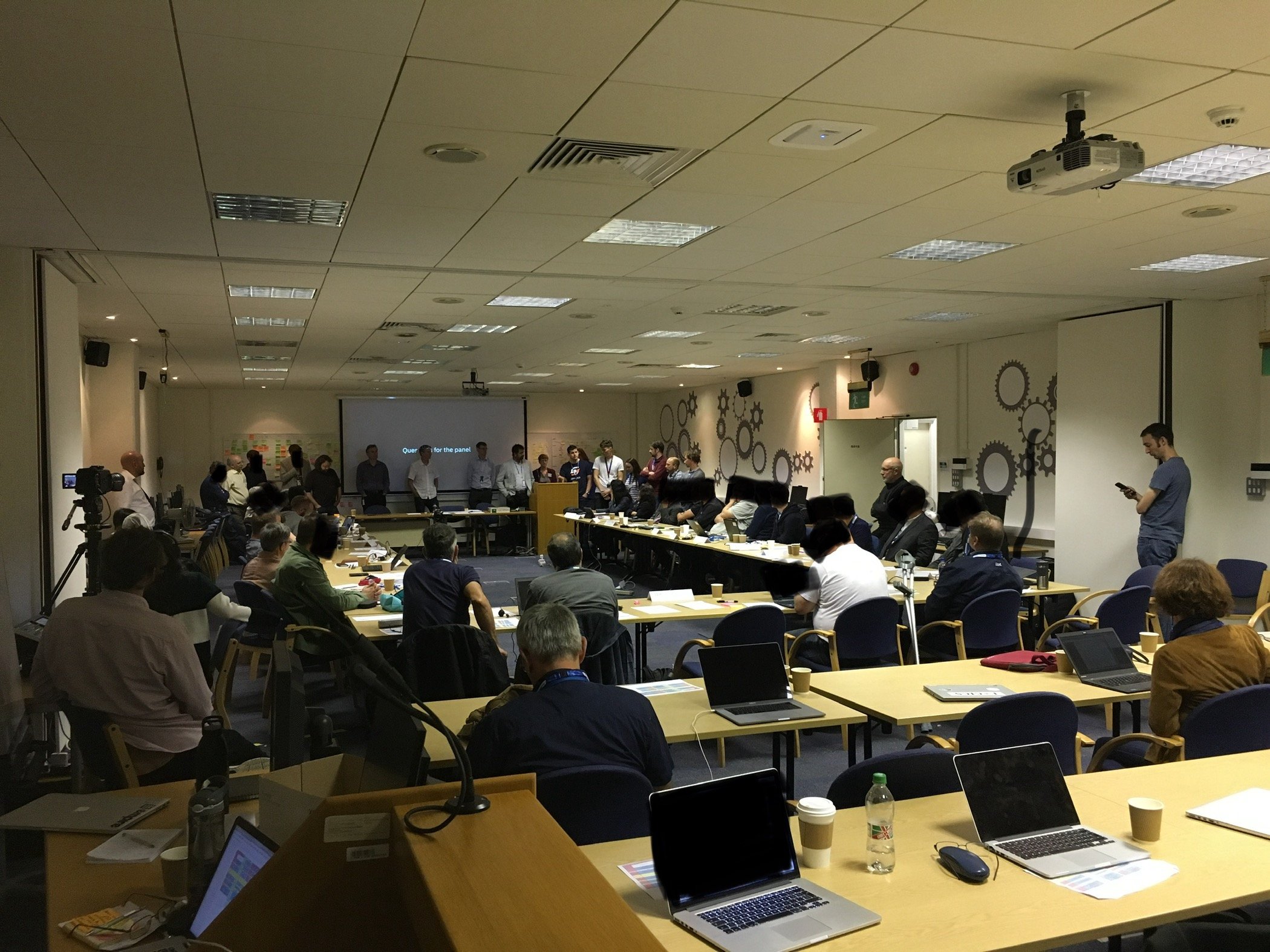
I led the majority of stakeholder workshops. Talking to in house Developers, Product Managers, and supporting staff was a great source of insight. Having them part of the redesign was essential to draw on their customer and product knowledge
Client team interviews
Our client facing teams worked very closely with our end users and were a great source of knowledge
Supported by user research
We ran our own user research sessions to gather specific product feedback. We also worked closely with our User Researcher who could share insights from her work across the product group. Collaborating and contributing to user research and testing initiatives throughout
Mapping out use cases, goals and “as is” features
Mapping out work flows, processes and use cases by frequent tasks vs uncommon gave hierarchy to the products interaction and how information could be displayed.
“As an MQ Administrator…
I need…
So I can…”
(Redacted due to NDA)
Evaluating the existing product’s UI vs our product vision and user goals
Flexible customisation interface
The UI was customisable, so a user could add in boxes and move panels around.
We wanted to enhance the UI to have a fixed structure to support a user when there was a lot of content to show.
Multiple single actions needed to complete a task
The range of interactions worked well for experienced users, our focus was to improve this for newer users too.
We wanted to create guided tasks that combined all the individual actions needed for that task into one process/interaction.
Many status messages
There were lots of relevant status messages. Our intention was to make this more focussed in one place.
Broad hierarchy of objects and associated information
Different connected objects such as message queues, message queue managers, message channels, message subscriptions were shown together on one view.
We wanted to work on the hierarchy to improve the association between objects.
Co-creating new ideas to build on the product’s experience
We knew the product was aimed at a specific subset of users who were less technical. Their requirements and goals gave us a lot of ideas to further improve the existing product
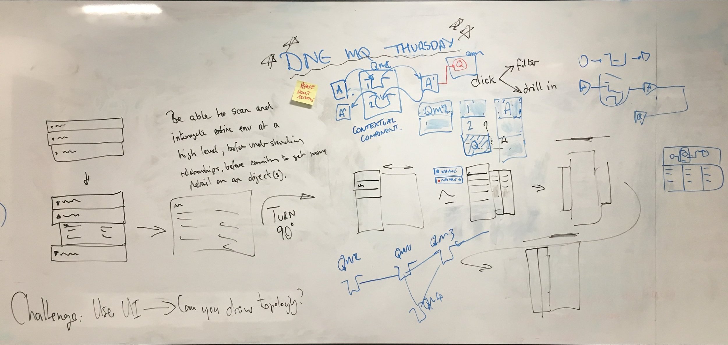
Making the complexities more simple by abstracting technical detail and using visualising technical object relationships
Working closely with developers throughout
Working up concepts with developers, Product and other stakeholders. Iterating designs on user need, complexity and value.
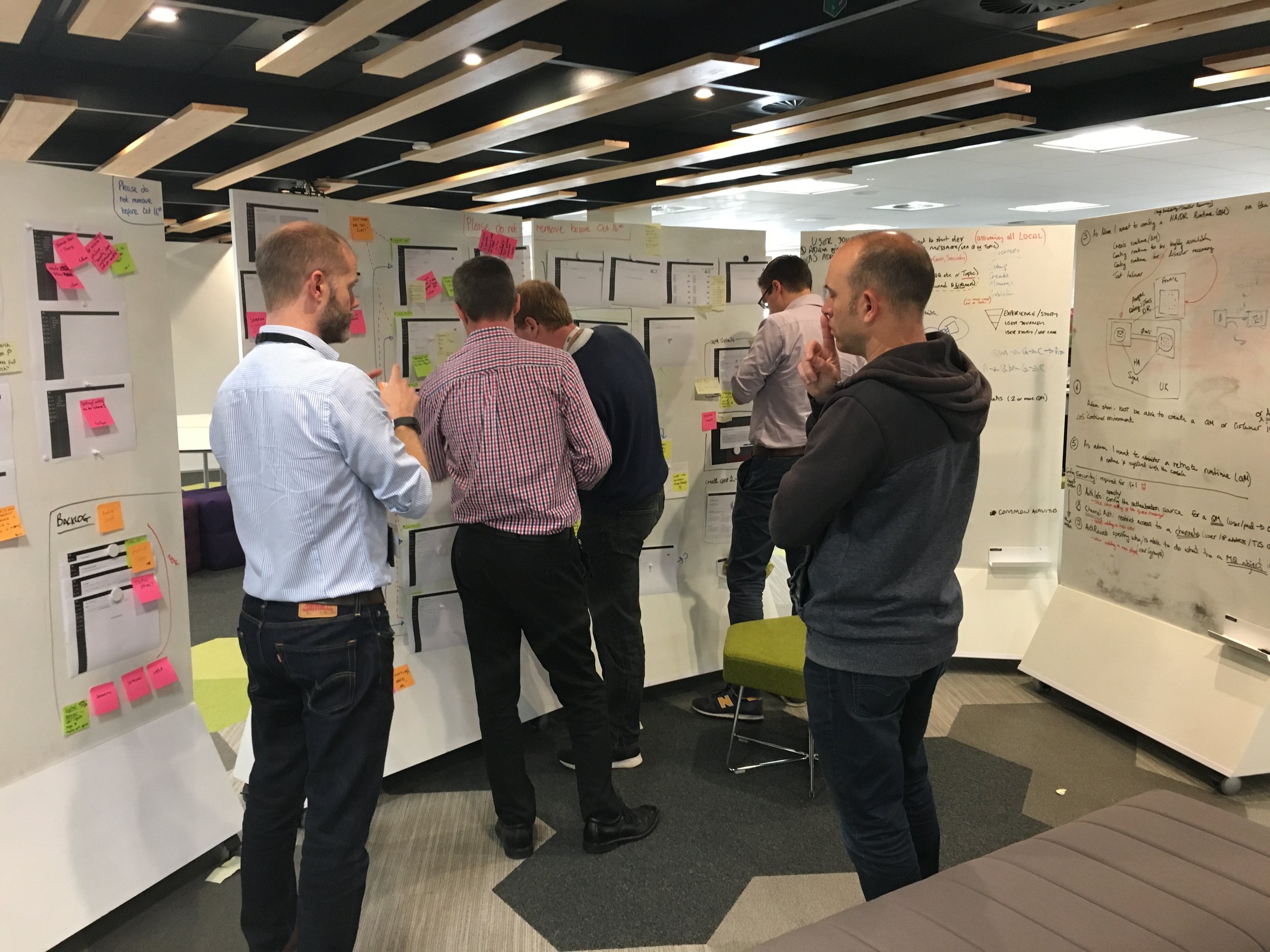
A unique challenge, checking consistent design decisions across the group’s products
Creating consistent interaction patterns, using the same components in the same way, requesting new changes together across 15 designers in the product group
How do you do this interaction?
How do you display additional information in this context?
When you create something, how does the interaction differ depending on the complexity?
Using and contributing to IBM Carbon Design system with new interactions
As a new redesign, we needed to align to the Carbon Design system. This posed some challenges as the design system team was based in New York so we had some interesting call times and collaboration could take a little longer.
Our built first release
Focussing on the highest value opportunities to add to the new release of the product. We worked collaboratively to finalise every small detail.
An updated sign in experience
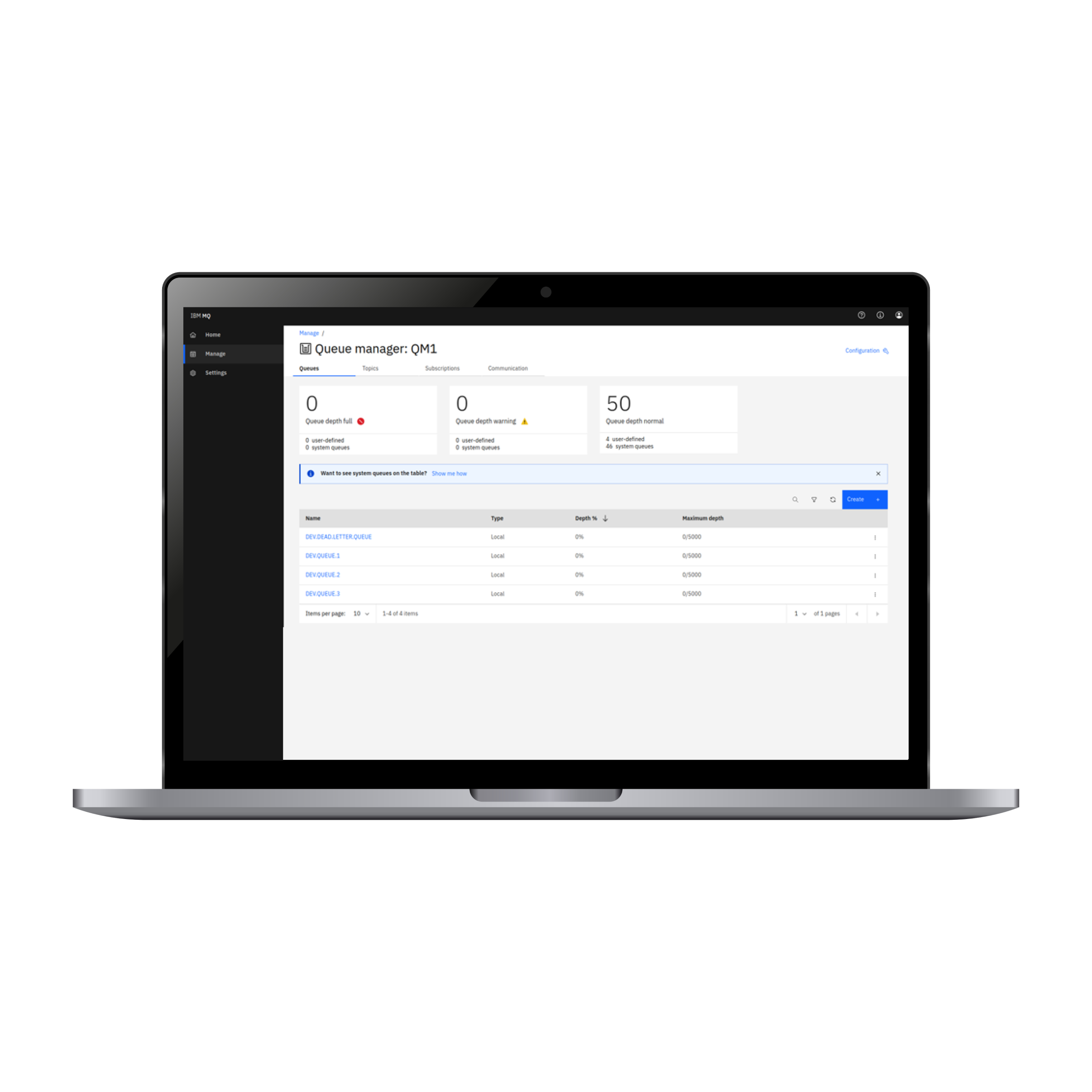
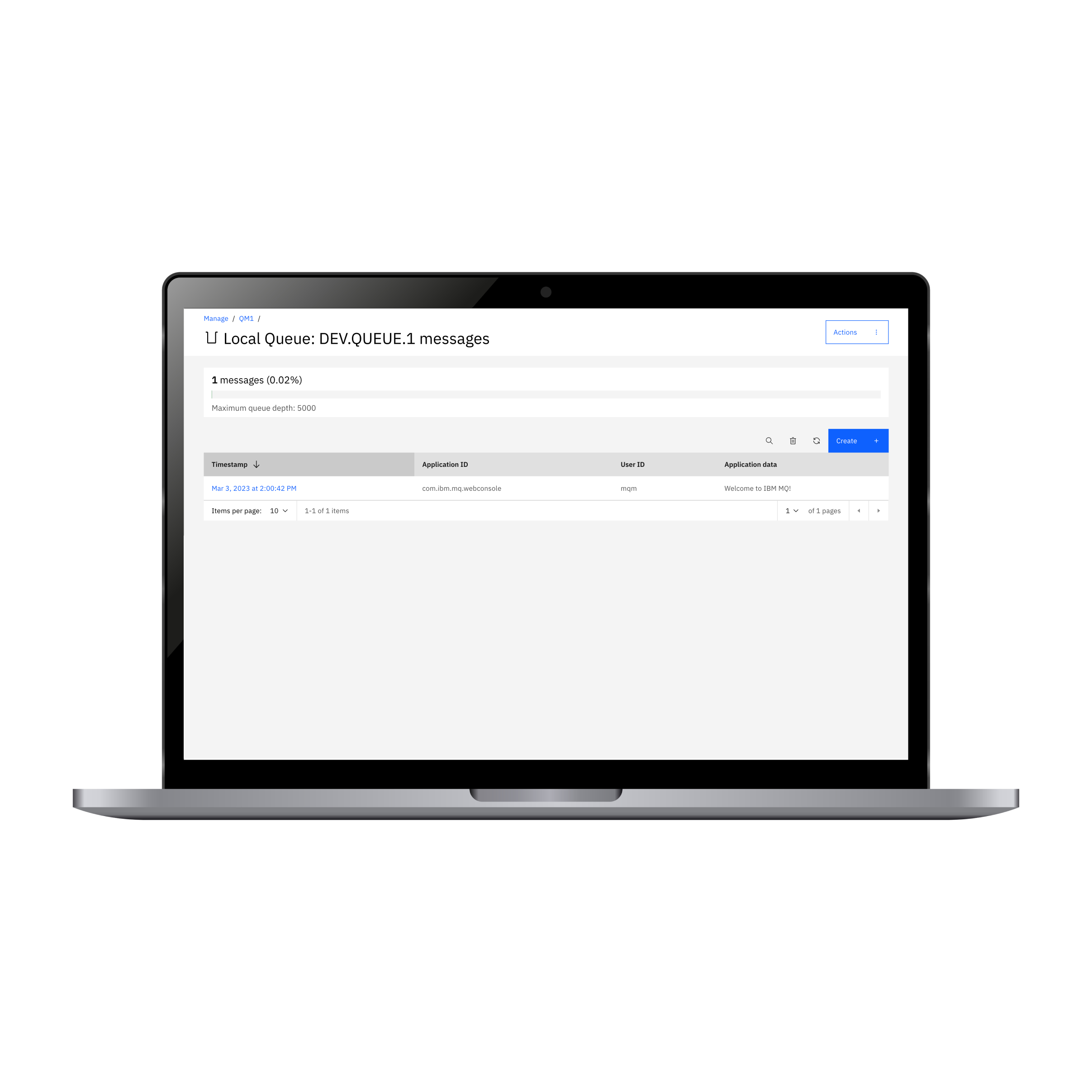
A new single page view for each object.
All associated and connected objects listed clearly.
New statuses bar with improved information displayed with supporting advice/actions
Simplified actions for objects listed in tables
A redesigned homepage featuring new key tasks, highest priority alerts and new learning resources added
Focussed detail pages for individual objects to deep dive into details message queues with concise actions


