Setting up a product design function at a green energy startup
What did Igloo Energy do?
Igloo was an energy supplier scale up and home tech start up, their mission was to reduce customers usage and in turn carbon footprint. By understanding our customers and their homes, we were able to provide personalised recommendations to reduce energy usage and energy saving home tech products.
I joining the company as it grew quickly, within 18 months the company grew to around 200 people. Customer growth was partly driven by our great customer service and winning several Citizens Advice customer service awards. Sadly at the start of the energy cost crisis, Igloo ceased trading in November 2021, like many small energy suppliers trying to challenge the big six suppliers.
My role
I was brought into Igloo to build a Product Design team to cover UX, UI and UR. My team started with one Graduate and I grew it to a team of five ranging from Junior to Senior roles with further plans to scale to a total of 10 across squads.
Key activities
Strategy and vision, contributing to OKR framework with product leaders
Recruitment, finding great people with the right balance of skills to support the mission
Ways of working, aligning design with dev and product
Design foundations, getting the foundations of a design function in place
Building relationships, building relationships with the growing number of stakeholders
Three key case studies from my time at Igloo
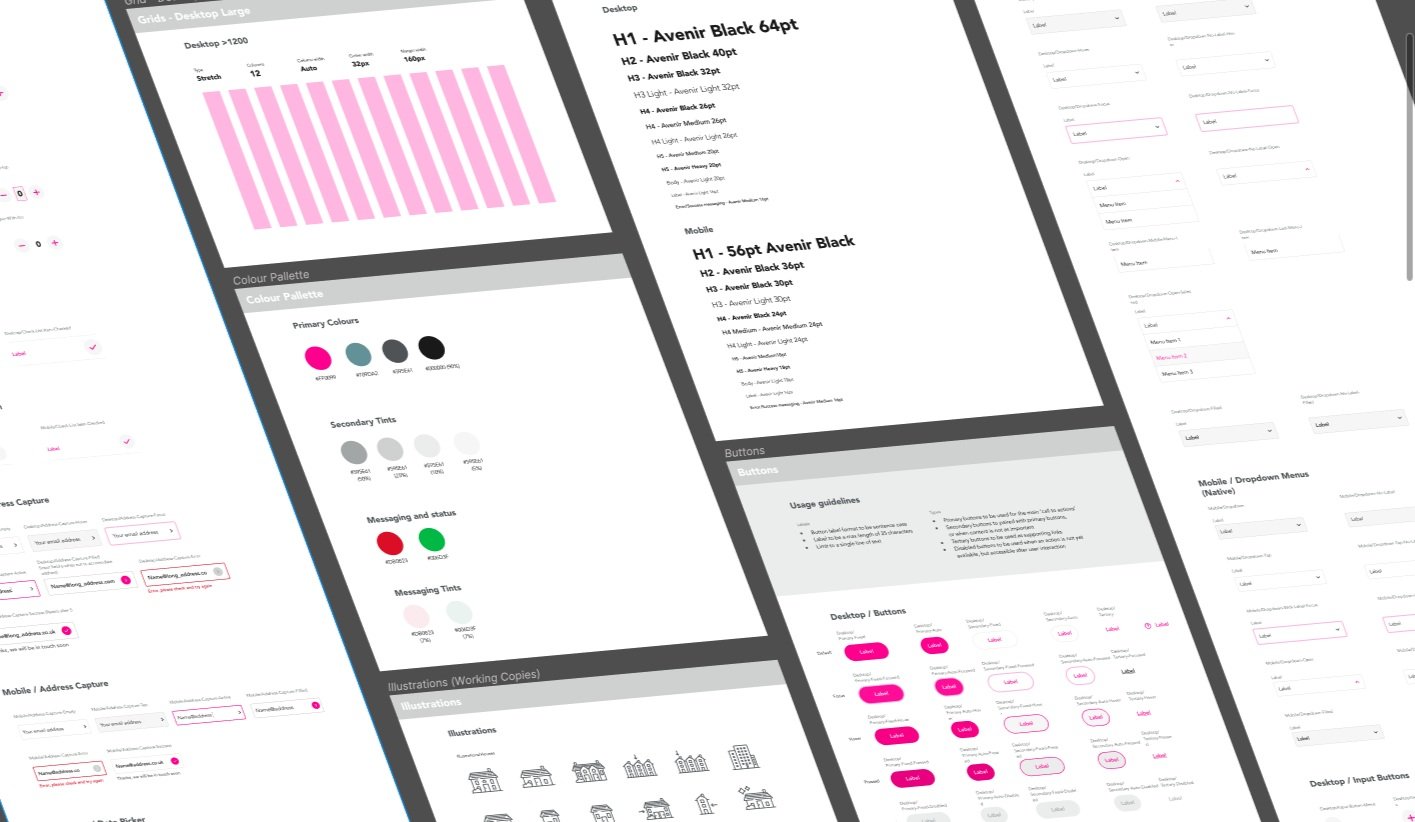
Creating a design language and design system
Igloo had been using a small design agency before I joined for all of it’s design work. The company had since achieved market fit and was scaling, but without any of the design foundations or team in place.
No files, no guidelines, no feedback mechanisms, no design strategy and no team.
Getting design foundations in place
Problem
Igloo had been using a small design agency before I joined for it’s brand guidelines and design work. The brand guidelines were broad and the execution of them in UI didn’t reflect the quality and consistency that the company aspired to.
The design language hadn’t been applied consistently creating disjointed looking pages, with content that was hard to follow. Accessibility, imagery, use of colour and iconography needed to be evaluated.
With a new CMS being put in place it was the perfect time to create reusable components to support the Growth team. I initiated the design system project with the owners that would speed how we created content and create a more consistent experience as we scaled.
Evaluating what we already had to work with
Our findings
Key messages were lost due to lack of visual hierarchy
Call to actions didn’t punch out due to the mix of styles, backgrounds and use of colour
Different styles applied across touch points / channels due to fast growth
Imagery treatment and tone was unbranded and didn’t have a consistent style


We needed a lightweight Design System to get consistency, and a revised design direction to improve our quality
Setting the design direction
We would need an lightweight design system to get consistency and our brand to life across our touch points.
At this early stage, the team consisted of two designers so I wanted to get a framework right with a contractor, so the team could focus on the solving the UX problems they knew well with Product ahead of a new UI assets. I believed that my early career designers would greatly benefit from a consistent, drag and drop, templates.
I got agreement to take on an a Lead UI Designer for three months. The whole team explored the old visual guidelines the Founders were passionate about keeping. My direction to the team was to pair back the use of the guidelines, look to make it consistent, work across all channels. Resulting in a renewed take on the brand guidelines the owners were passionate about, improving the quality forward and moving forward in a simplified design language.
Reducing the complexity of the existing brand guidelines and tightening up our design language
We looked at design elements that would make our challenger energy brand identifiable. We evaluated the brand values


Understanding the competitor landscape, what are customers were seeing in the same space. As well as other influencing exciting design
We spent time evaluating competitors and best in class examples, working up mock ups, and facilitating workshops with the company owners. Looking for ideas and inspiration and how we could differentiate our UI style within our own market.
Pushing new styles using mockups
Testing how we could push and the branding with varying use of the primary colours and use of shape
The team were encouraged to explore the use of pink and teal which were the primary colours.
Use of shape, texture and overlays were also explored.
Treatment on imagery was also considered, could we create our own Igloo lifestyle imagery digitally- rather than using inconsistent stock imagery
Getting feedback on final three design directions from our customer base using Optimal Hub
Initial user testing was captured on early designs using Usability Hub to check the brand was perceived in the way we wanted by our target demographic. We would make iterations through further user testing as the projects used the DS.
Understanding our customers through research
Leading generative research to inform our strategy. Focussing on understand customers decisions to purchase, install and use a niche green heating product in their homes.
Problem
We had little research on heat pump owners purchasing decisions and installation experience. We needed a fuller picture of the journey to learn and gain insights into this niche heating product. So that we could find competitive opportunities to disrupt the space.
Context
Igloo offered low carbon heating products called air source heat pumps. They are an up and coming new form of heating, commonly found in off grid homes and larger properties. They are a more expensive heating option and require more work to install. For these reasons there are few owners and we didn’t know enough about them.
Challenges
A lack of user research. Whilst Igloo had some quantitive market research on heat pumps, there wasn’t the depth of user research to understand the customers experience with buying, installing and owning a heat pump.
Outcomes
We were able to invite some of Igloo’s energy customers who owned one to take part in a survey and follow up paid interviews. We aligned as a group to workshop what aspects we want to explore in our research as well as engaging the owners in the process. Broadly this resulted in the end to end customer journey, the hardware itself and the context of the purchase.
The research would allow us to make data driven decisions on content, messaging and features. As a start up, or any sized business, identifying and understanding what the pain points are in the market or product are essential to make a unique and differentiating experience.
Running a discovery workshop with founders to get buy in and a align on research goals
Finding the right group of users to survey
Starting with a survey to give initial quantitive data allowed us to segment and compare results. It also included an option to participate in follow up research. We were able to define a particular context of heat pumps owner based on their other answers. For example, we wanted a mix of people who had good and bad experiences of heat pump ownership. We used this follow up list of customer to invite them for interview.
Inviting a segment of the survey responders to interview in more detail
400+ survey invites sent
162 completed surveys
80% signed up to future research
13 of 15 interviews successfully completed
We synthesised the research using a white board, adding to it after each interview. Combining the survey and interview research gave a clear indication of four personas. It also allowed us to build an experience map of getting a heat pump. These artefacts were then shared with the business stakeholders through 121s and show and tell sessions.
The personas were used in design thinking workshops to ideate on future experiences and features for our ASHP customers. It allowed us to root ideas in real customer data. In addition to design thinking, we were able to evaluate the relevancy of our webpage content and features. The insights would help form our website and opportunities to make the product easier for a broader audience.
Creating customer archetypes to articulate to the founders and company, the different motivations and motivations for buying a heat pump
Naturally the research that led to these archetypes helped us to identify pain points. We took the feedback and insights into ideation sessions with Product, resulting in new services and supporting content to sell this specialist product.
Applying design thinking to help achieve our company vision
Context
Having spoken to real heat pump owners, we could now host creative workshop sessions to identify how we could be a differentiator in the market. Each workshop was rooted in insights from our research with genuine pain points to solve collaboratively.
“How might we… improve our heat pump product proposition… so that we can be a market leader in this product’s space?”
“How can we… increase customer smart meter installations… so that we can get more reliable usage data to estimate our energy costs”
Additional projects
Bringing the company vision to life
Working with owners and other leaders to establish how Igloo could be a differentiator in a crowded energy market. Producing conceptual ideation work for future experiences to test with customers as a sounding board helped shape what we built as an MVP.
The team recruited a group of proactive customer service agents who attended fortnightly “Customer Service Forum” workshops on customer pain points as a way of proactively finding qualitative feedback that we would then quantify with supporting analytics. Additionally for first impressions on new design work too - the more people you show, the more feedback you get. This gave a real insight into that channel and gave the agents a chance to engage, have a voice and demonstrate the company values.
Getting fast feedback from customer champions
I designed a simple structure to articulate expectations across the experience levels in the design team. This was then shared among Product and Engineering leaders to ensure consistency across the different crafts and teams, as well as aligning expectations.


